Enhancing Brand Identity through Character Customization
Introduction
Vyond is an AI-powered video maker and all-in-one video creation platform designed for businesses. As we evolved into a must-have tool for enterprise teams, a pattern emerged:
our users wanted characters that looked like their brand.
Not just in tone or story, but literally logo tees and all.
The Problem
Big teams = bulkier brand guidelines.
Our design-conscious enterprise users needed an easy way to ensure that every frame of their videos adhered to their company's strict brand identity standards.
This gap not only affected visual consistency, but also created friction in workflows for teams trying to adhere to brand guidelines across all content.
Target Audience
This feature was designed primarily for enterprise users—communication teams, learning and development professionals, and marketers—who needed to maintain a strong brand presence in their video content.
These users typically worked within structured brand systems and were looking for tools that offered both creative flexibility and control.
Persona
👤 Poppy Smith
Poppy is a senior content strategist at a global telecommunications company. She is responsible for producing countless internal onboarding and training videos a year. Her company enforces strict brand guidelines — logos must appear on the left chest of uniforms and never overlap seams or other graphics. Even small violations get flagged at quarterly audits.
“I want to apply logos to character outfits in a way that automatically aligns with our brand standards,
so I can reduce review time, eliminate compliance errors, and produce polished content at scale.”
Persona Goals
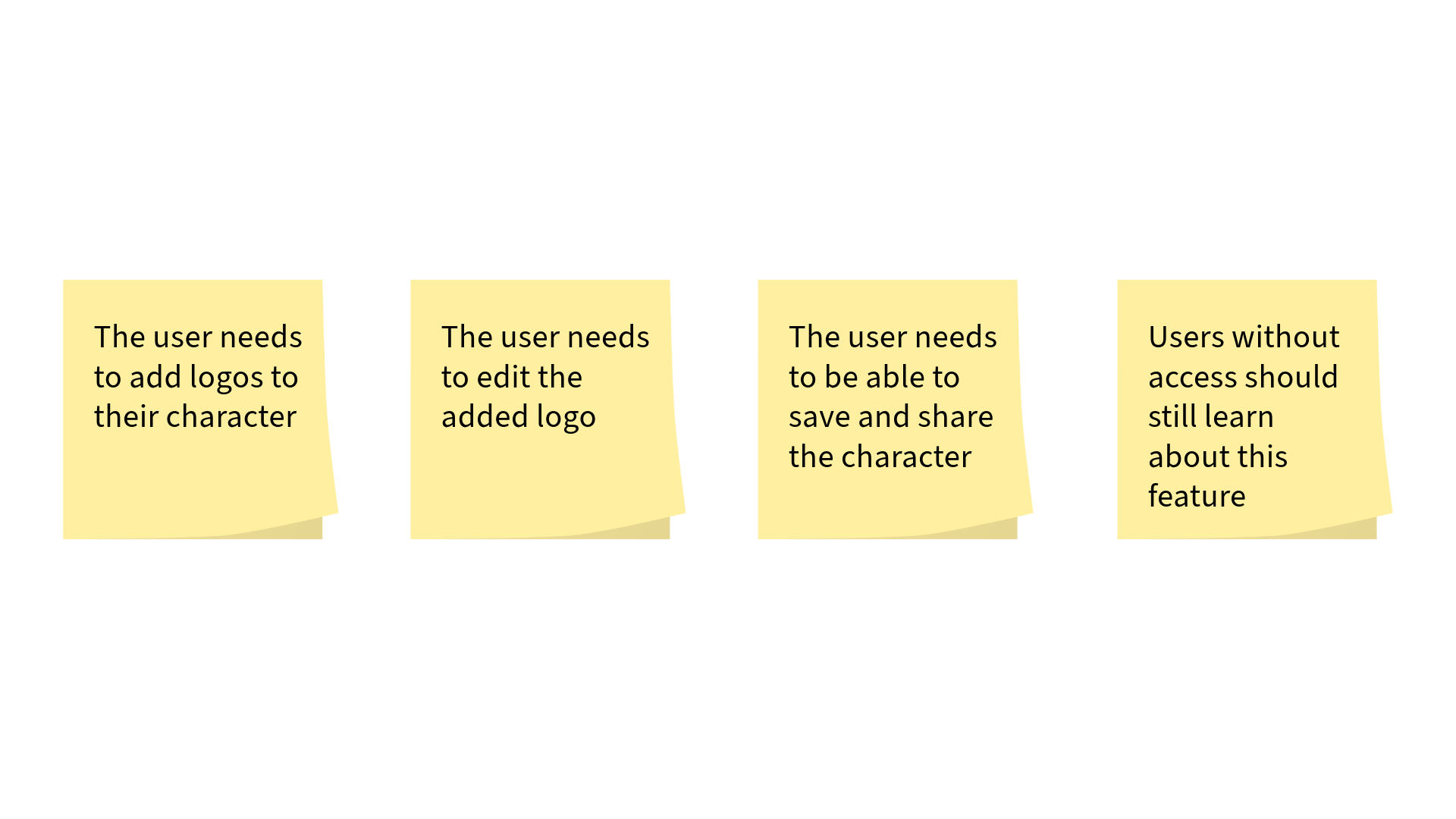
Empower team members to create branded videos faster
Reduce the number of compliance errors related to character outfit branding
Streamline review cycles with legal and branding teams
Persona Pain Points
Manually applying logos in different scenes and outfits is tedious and error-prone
No guardrails—easy to misplace or resize logos incorrectly
Wasted hours in review cycles fixing inconsistent logo usage
Product Goals
Make it easy—even delightful—to brand characters with logos.
Build a feature with a minimal learning curve.
Ensure final visuals are polished, flexible, and on-brand.
Process
We began by analyzing the existing customization workflow and identifying the barriers users faced when trying to add logos or brand marks.
Our goal was to design a solution that integrated seamlessly into the current user experience, minimizing the need for additional training.
Having already established the user mindset through user interviews and other research tools, I deconstructed the overall feature into four phases so that we could easily match a user need to each phase.
Step 1: Understand the Flow
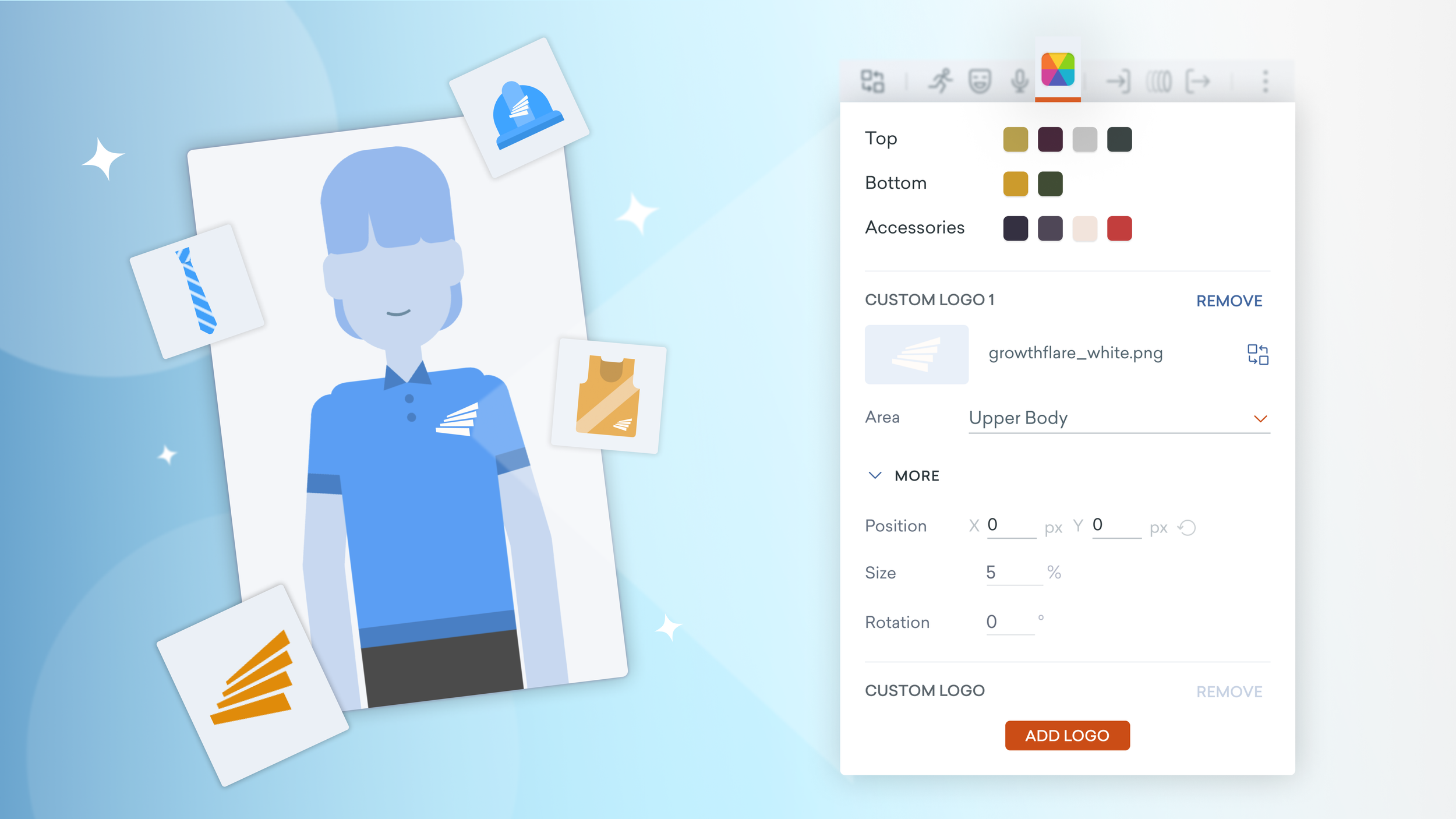
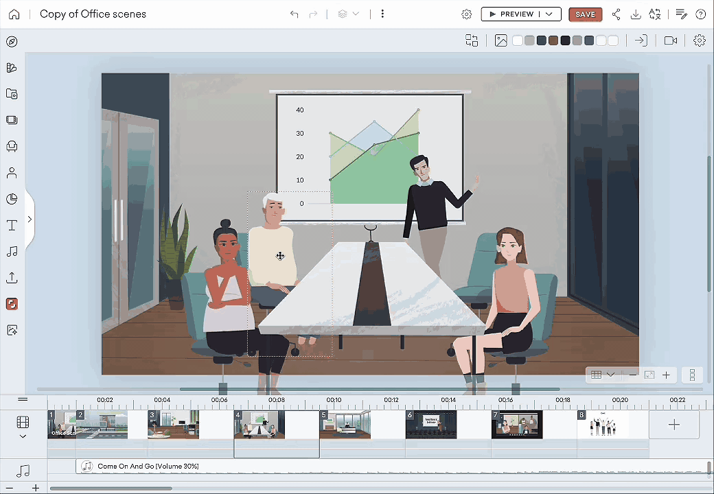
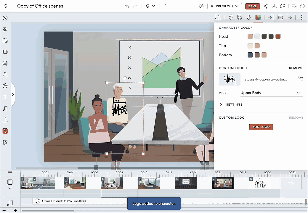
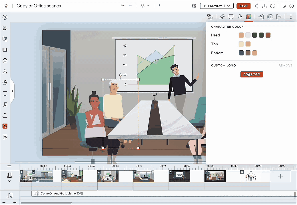
Instead of introducing a completely new interaction model, we built on existing user behavior. Users were already accustomed to adjusting character properties via the right-side style panel. Since we had recently introduced a panel for adjusting character colors, it made sense to extend that system to include logo settings.
This placement also allowed us to leverage the “Joy of Discovery” in giving users a sense of ownership of having “found” this new tool which could naturally fit into their existing video making workflow.
Step 2: Lean on What Works
We knew that to keep the tool highly learnable, we could not present our users with every design manipulation that exists under the sun, instead we opted to keep things simple. They could reposition, resize, and rotate the uploaded designs. This way, users are able to quickly and easily digest the settings panel and still achieve their design vision.
Due to technical limitations in how character elements are rendered on the canvas, drag-and-drop placement was not feasible. To address this, we implemented a control system combining dropdown menus and pixel-level input.
Users could select the placement area (e.g. headgear, body, right arm), and then fine-tune the size, rotation, and positioning to achieve a clean, consistent look.
Step 3: Design for Constraints, Not Against Them
From design critiques, to solution pitches, to usability tests, we kept honing.
One insight: users didn’t want to lose their place mid-task, so we made sure that when they selected a logo from the left panel, the right-side Color/Logo panel re-opened automatically.
This auto redirection is new to our studio but breaking this existing pattern of keeping the left and right panels completely separate just made sense for this feature. Little touches, big wins.
Step 4: Test, Iterate, Re-test
Result
The feature launched in September 2024 and received positive feedback from our user base:
Several enterprise accounts upgraded their plans just to get access.
Users praised the intuitive flow—no documentation required.
Teams loved how “on-brand” their content suddenly looked.
How did we help Poppy?
🧩 Easy placement guidance means that logos can easily snap to brand-approved locations with sizing safeguards.
🎯 Faster branding application process for Poppy
🎯 Higher confidence among Poppy’s non-designer team members to apply logos independently.
🧩 Reusable branding templates and shareable characters with preset uniforms that can be used across projects.
🎯 Decrease in logo-related revision requests for Poppy’s whole team.
🎯 Increase in trust from branding and legal that new content will consistently be on-brand.
Conclusion
This project was an opportunity to dig deeper into the needs of enterprise teams working within defined visual systems. My key takeaways:
Creative tools don’t have to be complex.
Enterprise users appreciate when you sweat the small stuff.
Constraints aren’t blockers—they’re invitations to be clever.
And most importantly, you can make following brand guidelines fun.
Check it out yourself at Vyond.
Due to NDA restrictions, I’m unable to share all the intimate details all the work that was put into this project, but feel free to get in touch if you’d like to learn more!